Art Journal – Inside Pages (Part One)
An art journal is not just a book filled with decorated pages. It is a quiet space where memories, thoughts, and emotions are layered gently—much like life itself. Each page becomes a pause, a reflection, or a reminder.
In this art journal, the inner pages are designed as memory holders, combining patterned papers, distressed edges, pockets, photo mats, and embellishments that invite personal storytelling.
Here is a detailed walk-through of five inside pages from this art journal.
Page 1: The Hidden Pocket of Memories
The first inside page opens with a soft floral patterned background layered with a contrasting pocket at the bottom. This pocket is intentionally designed to hold loose notes, photographs, or handwritten thoughts—things that don’t always fit neatly into a fixed space.
A small tag peeks out, hinting that there is more beneath the surface. Subtle embellishments add charm without overwhelming the page. This page sets the tone for the art journal: memories don’t need to be displayed loudly; some are meant to be tucked away and revisited quietly.
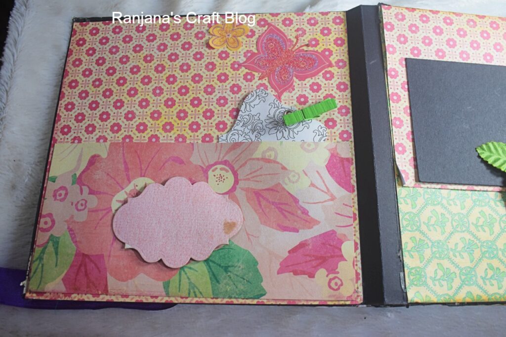 The first page
Page 2: Nature as a Memory Keeper
This page brings in strong elements of nature and nostalgia. A dark photo mat creates a grounding contrast against the patterned paper, while layered flowers soften the composition. A small bird embellishment sits calmly, symbolising thoughts, messages, or moments that once flew by but are now gently captured.
This art journal page feels like a reminder that memories often come from ordinary moments—walks, conversations, or pauses in everyday life. On this I want to record something I expirienced with the nature.
Page 3: Playful Reflections and Thought Corners
With bold polka dots and geometric patterns, this page introduces a playful rhythm into the art journal. A strong black photo mat anchors the layout, making it ideal for photographs or journaling.
Small decorative elements—like a circular accent and tiny pins—add a sense of movement, suggesting curiosity and exploration. This page feels like a space for ideas, goals, or fleeting thoughts, where not everything needs to be perfect or permanent.
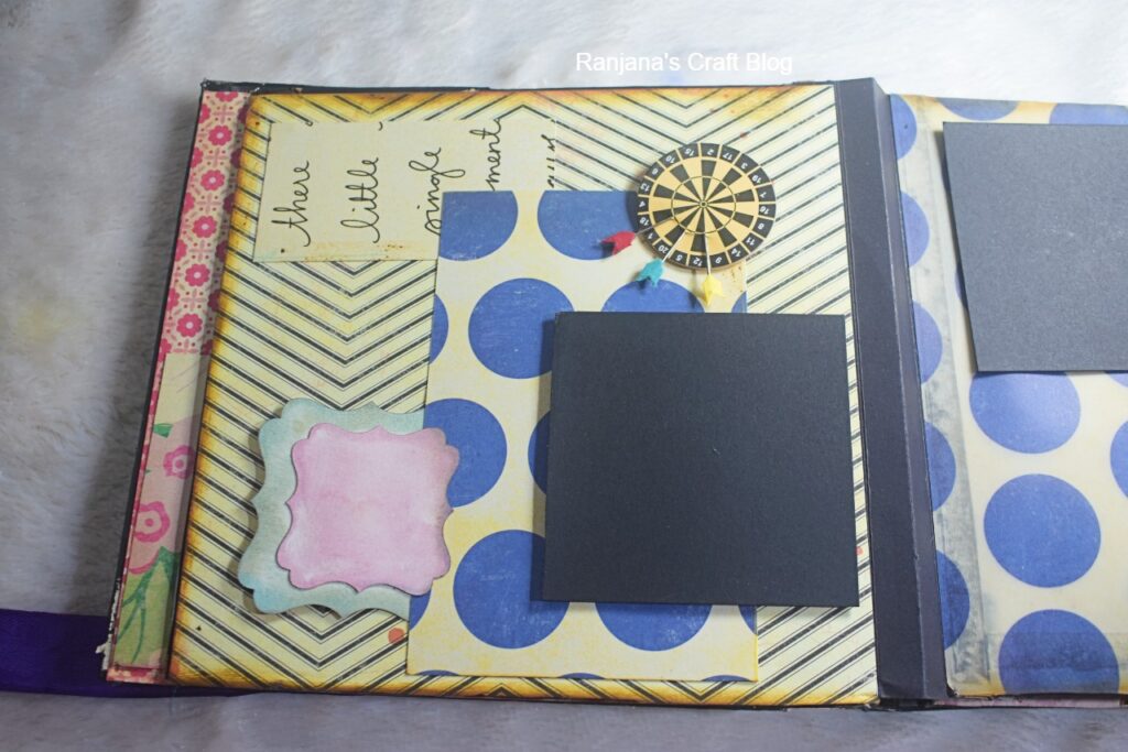
Page 3
Page 4: Space to Breathe and Bloom
This page is intentionally more open, allowing the design to breathe. The polka-dot background provides energy, while floral cut-outs soften it with emotion and warmth. To match the page beside that, I have used same pattern paper, thats is Polka dots pattern paper.Blank journaling spots are placed thoughtfully, encouraging handwritten reflections or meaningful dates. Just to contrast man made design with the design created by nature, I have used the floral embelishments.
In an art journal, not every page needs to be full. This page celebrates white space and pause, making room for emotions that surface slowly.
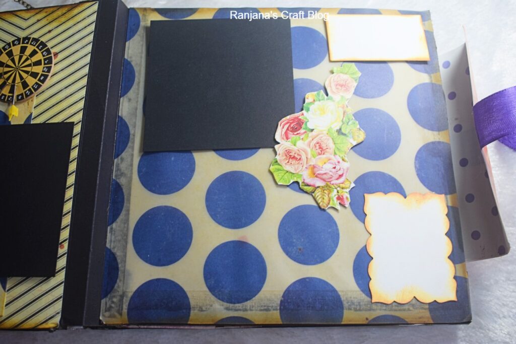
Page 4
Page 5: Vintage Layers and Emotional Anchors
The fifth page in this set carries a more vintage, grounded feel.I always love vintage designs. Distressed edges frame the page, giving it an aged, lived-in look. A bold black mat contrasts beautifully with warm patterned paper, while a dimensional flower embellishment acts as an emotional anchor.
This page feels reflective—ideal for deep journaling, gratitude notes, or life lessons. It reminds us that memories gain richness over time, just like layered paper and ink.
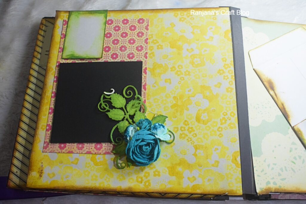
The fifth page
This is Part One of the art journal journey.
The remaining pages will be shared in Part Two, where the story continues with new textures, layouts, and emotional layers.
Love,Laugh and Live the life to the fullest,
-Ranjana