Balancing Color , Border and Motifs in Saree Designing
Balancing color, border, and motifs is very important in saree designing. If this balance is not right, both the effort and the fabric can go to waste.
Whenever I design a saree or a dress, I spend a lot of time planning—choosing the color combination, deciding where the motifs should go, and how the border should be placed. Everything is thought through carefully.
But even after so much planning, the final result doesn’t always come out exactly as expected. The design takes its own direction.
That is exactly what happened with this saree too.
Border placement:
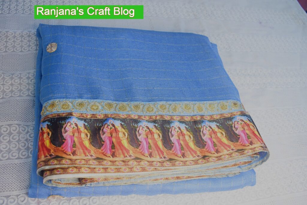
This is a beautiful , digital printed border from my stash.
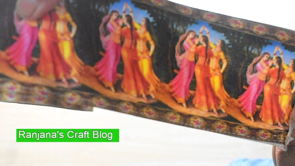
Beautiful border
This border has images of ladies playing, and I like to imagine them as Radha and her friends. The colors in this border are vibrant—pink, yellow, red, and blue—which immediately caught my attention.
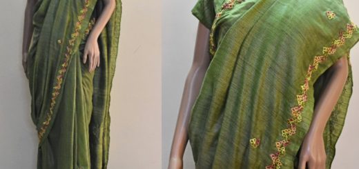
To complement these colors, I chose a light blue fabric. The fabric itself has subtle zari squares, which adds a gentle shine without overpowering the border.
I placed this border along the edges of the saree and extended it to the pallu, allowing the design to flow gracefully.
The saree with border
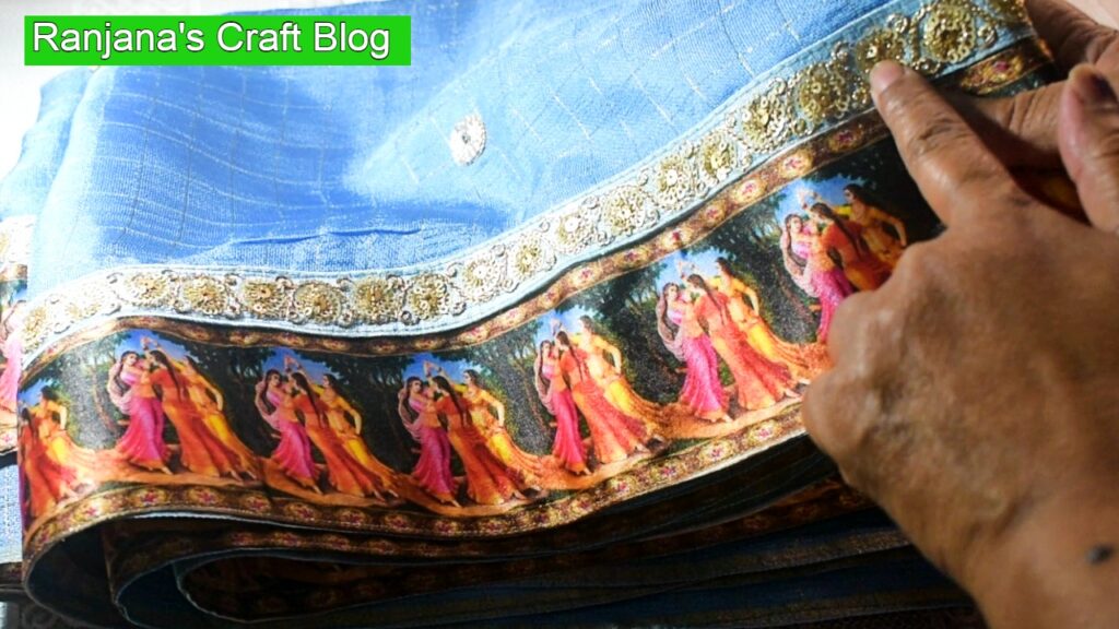
The blue lace on the saree
First, I attached the broad border. After that, I added a small light blue lace from my stash on top of the broad border.
Even though the main border already had blue in it, once I attached it, I felt the contrast was too strong. It was standing out separately instead of blending with the saree. It needed something to visually connect it with the base fabric.
That is when the small blue lace helped. It acted like a bridge, merging the colors of the border with the saree.
In embroidery, painting, or any kind of designing, contrast is important and adds beauty. But at the same time, contrasting colors should also blend with each other. Otherwise, they appear disconnected, and the overall design may not look harmonious.
After adding the blue lace, the saree no longer looked like a border was simply attached. Instead, it felt like the border was a natural extension of the saree itself.
Placement of motifs in the empty space:
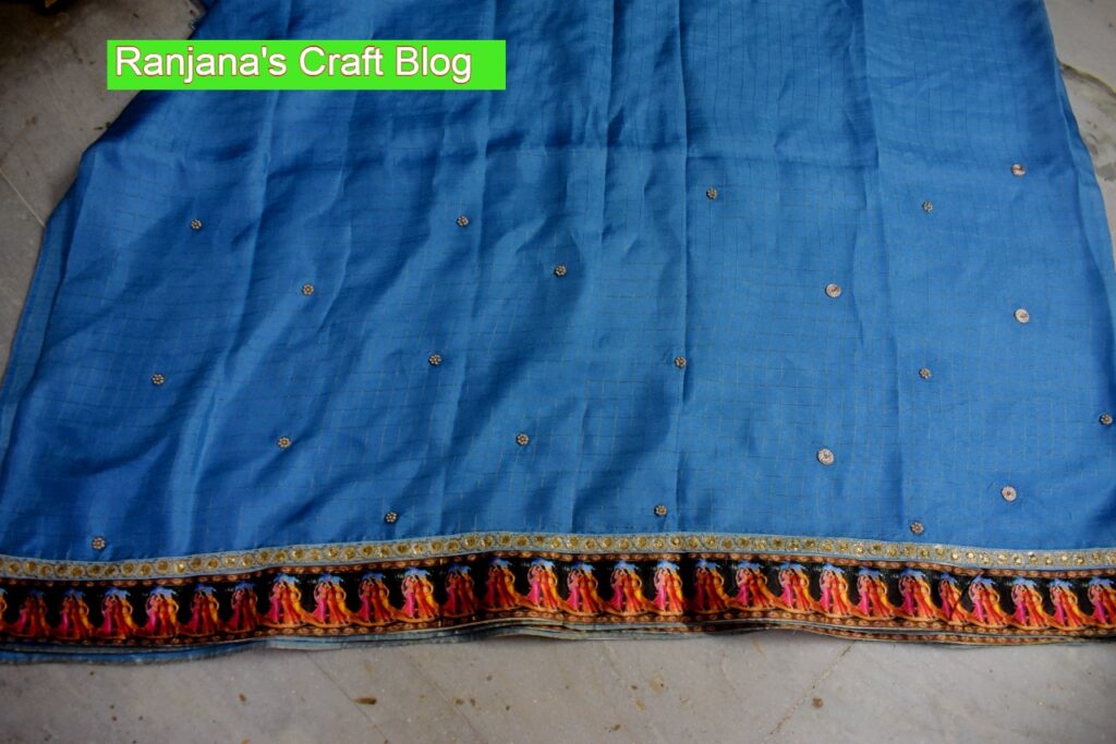
Placement of motifs
Now comes the placement of motifs. The saree could have been left as it is after attaching the border, but adding motifs makes it look more grand and unique.
Initially, I thought of painting Krishna’s symbols like the flute or peacock feather on the saree. But the fabric was not suitable for painting, and since I am still learning fabric painting, I did not want to take the risk of spoiling it.
So instead, I used the circular motifs I already had and attached them to the saree. The shape and design of these motifs blended well with the blue border, creating a balanced and harmonious look.
Nowthe draping on the maniquinn :
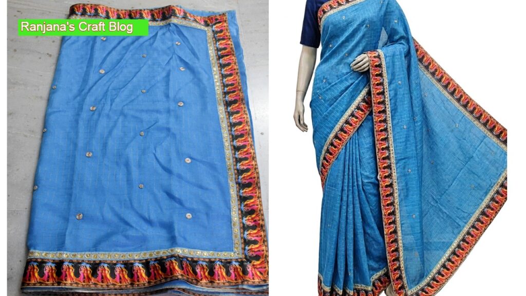
Draped on maniquin
When colors and motifs are chosen carefully, the saree naturally looks elegant and harmonious.
Love,Laugh and Live the life to the fullest,
-Ranjana